Last Updated on June 1, 2023 by admin
Of the 12-15 Google Ads accounts that I manage on a monthly basis here at Netvantage, I am starting to see a handful of accounts be presented with a blue bar at the top of the Google Ads screen upon logging in inviting us to Explore the new design. Perhaps you have seen it.

Well, let’s explore it:
At first glance, lots of white space and frankly, it’s cleaner, prettier. That is purely my own qualitative opinion.
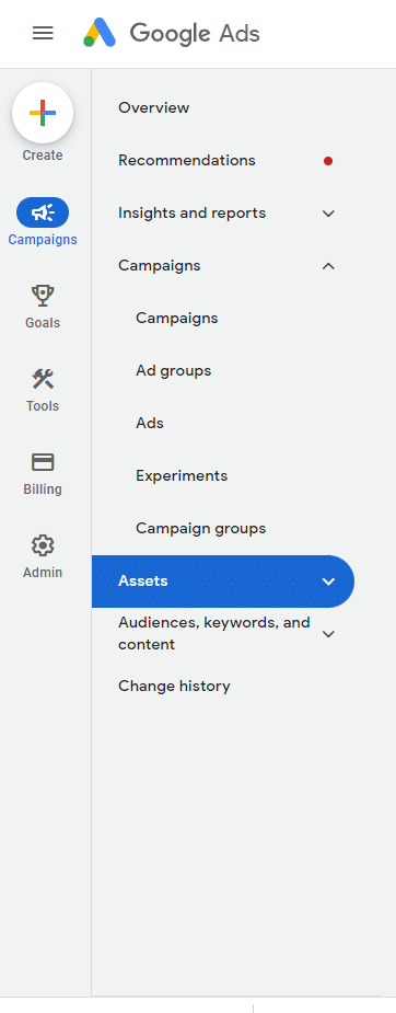
There is now a secondary, outside vertical navigation menu which now contains old top-level items from the previous interface. These are Tools, Billing, and Admin. Goals have been extracted from Tools and are their own navigation item with conversions and measurements.
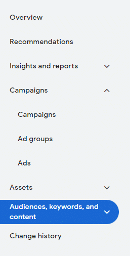
Most of our secondary standard vertical left-hand navigation has remained, such as Overview, Recommendations, and Campaigns. Assets now have their own navigational tab, while Ads are tucked underneath the Campaigns tab. Additionally, the Audience and the Change History have stayed in the familiar place.
In a flip of the old interface, users can click on the 3 bar top left menu item to actually shrink the Overview/Campaigns navigation, but the first navigation column stays sticky. My guess is that users will not like this change, often times you shrink the left-hand double navigation to gain more screen share as you go through ad group, keyword or ads data. This is a questionable change for me.
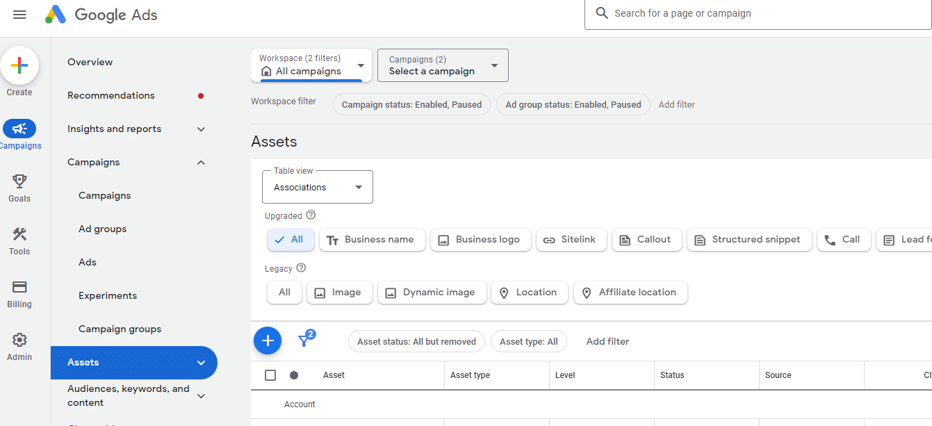
Workspace filters, which I really like to use when trying to narrow down search, display and video campaigns have moved from the upper left-hand corner to a mid-left-hand corner placement. I do like this change, often the old filters were “far away” in my mouse scroll workflow:
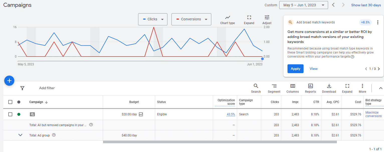
After those changes, well, it’s really window dressing with the exception of one key change I address below. Mostly, once we get into the core of campaign management, the main work window hasn’t changed. And I am good with that. Changing too much could be jarring for advertisers who aren’t heavy interface users. You can click through into Campaigns, Ad Groups, Keyword performance metrics, and even the font is the same:
However, as there is always an asterisk with Google Ads, it seems harder to get into keyword performance data. Notice in the campaign’s tab flyout, there are Ad Groups, Ads, Experiments, and Campaign Groups. What don’t we see? Keywords. The keyword tab has been tucked under the Audiences, keywords, and content tab. This is interesting to me as Google in the last 2-3 years has hinted at the diminishing value of keywords versus audience targeting and also versus letting Google take the well in terms of advertising away from keyword selection and bidding: think Max Clicks to the aggressive pushing of Performance Max.
Old: New:
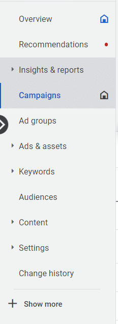
Am I reading too much into this subtle change? Maybe, but I do know that when I like to do an aggregate run-through of actual search query reports to see what the market is actually typing and go on a negative keyword binge, this will create extra steps in my workflow.

Leave a Reply